
How Microsoft Power Platform is helping to modernize and enable...
In this webinar, our experts showcase a variety of demo use cases of how different components of the...
Businesses today are pushing to bring their business questions to their data. They are doing so alongside bridging the gap between obtaining data analysis for a business problem and using it to drive decision making. Indeed, they are aiming to maximize their Data Asset Value by:
This also means there is a lot of focus being put into maintaining quality data, which begs the question of whether a simple visual tool and process exists for evaluating data quality gaps that any business user can take advantage of. These data quality gaps are not confined to only missing, incomplete, and conflicting data formats and types, but also gaps in:
A deep dive of the HCL Microsoft Business Application Practice’s Data Quality Assessment process will highlight the simple, people-first approach of the Data Governance project cycle that has been developed around Microsoft Power BI’s data profiling feature. In this blog, we focus on that data profiling feature and how it helps derive valuable insights into the quality of your data.
The data profiling tools provide new and intuitive ways to clean, transform, and understand data in Power Query Editor. They include:
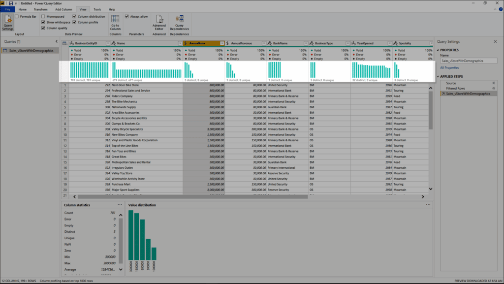
To enable the data profiling tools, go to the Power Query Editor and click on the View tab on the ribbon. Enable the options you want in the Data preview group, as shown:
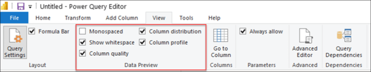
After you enable the options, the screen display should mimic the following image in Power Query Editor.
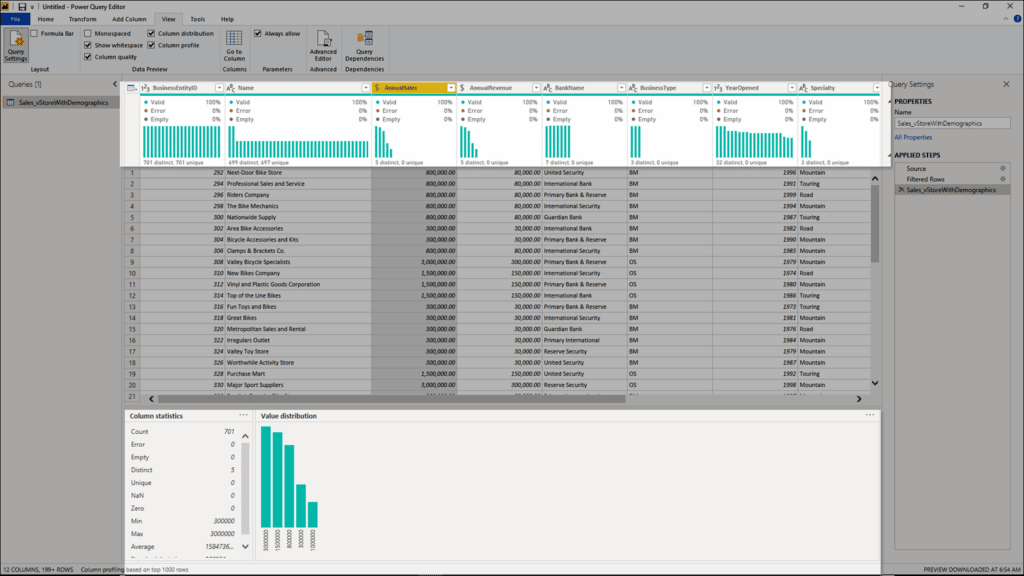
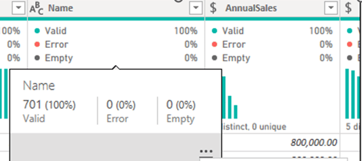
The column quality feature labels values in rows in five categories:
These indicators are displayed directly underneath the name of the column as part of a small bar chart, as shown:
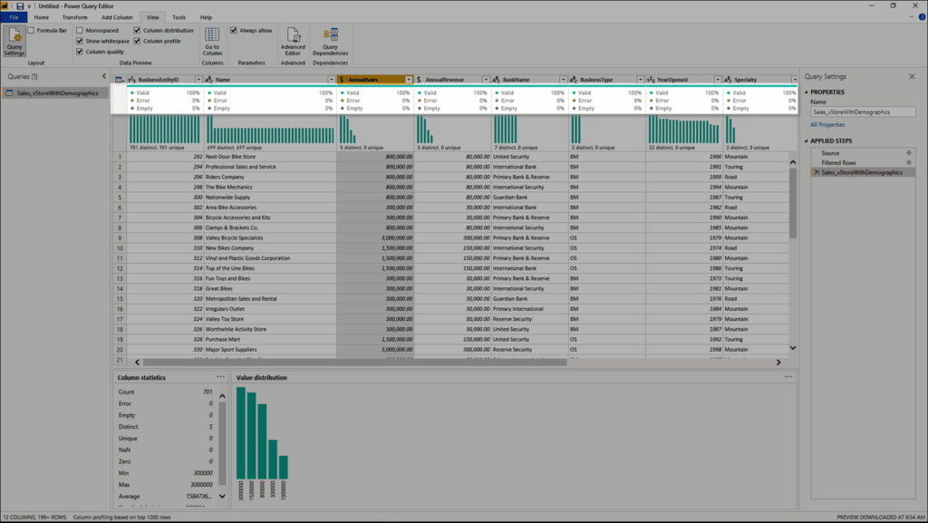
By hovering over any of the columns, you are presented with the numerical distribution of the quality of values throughout the column. Additionally, clicking the ellipsis (...) opens some quick action buttons for operations on the values.
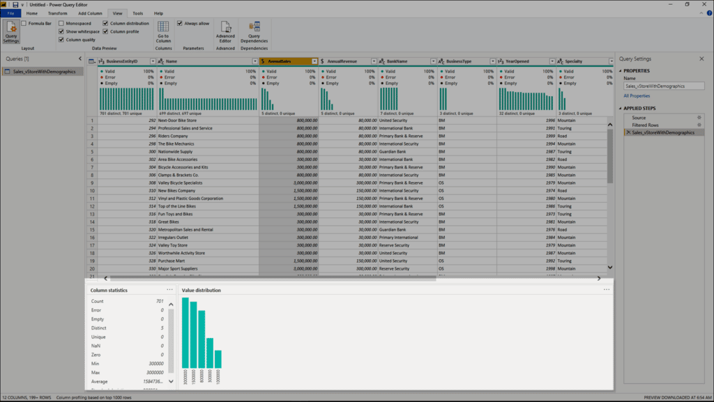
This feature provides a set of visuals underneath the names of the columns that showcase the frequency and distribution of the values in each of the columns. The data in these visualizations is sorted in descending order from the value with the highest frequency.
This feature provides a more in-depth look at the data in a column. Apart from the column distribution chart, it contains a column statistics chart. This information is displayed underneath the data preview section, as shown:
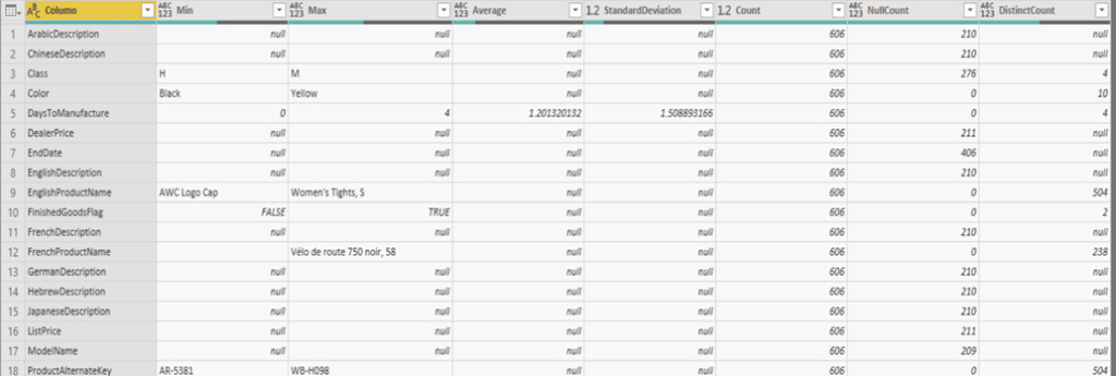
We will use a power query function (Table.Profile()) in Power BI that processes a table of all columns and returns a profile for the columns in table as shown below, and then use that table to build dashboards.
Happy Power BI’ing!