
How Microsoft Power Platform is helping to modernize and enable...
In this webinar, our experts showcase a variety of demo use cases of how different components of the...
There are so many times that you just wish to mimic the SharePoint Table editing or Model Driven App Editable Grid control in Canvas. In today’s blogpost, we will show you how to create a Responsive Editable Grid in Canvas App as quick as possible with the Horizontal container and Vertical container.
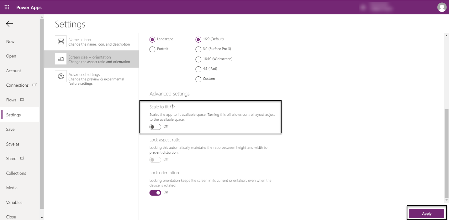
Step 1: Turn off “Scale to fit” setting
Go to File > Settings > Screen size + orientation
Under Advanced settings, turn off “Scale to fit”.
Hit Apply and click on Back button once the setting is saved.
Step 2: Place a Vertical Container on the Screen that we want to have editable grid. You can add formulas in Width and Height of this Container, so it fits on the screen. Here, we will name this container as “TableContainer.”
Make sure Align (horizontal) is Stretch. You can also put Gap as 10 or 15 to have some gap between components.

Step 3: Inside “TableContainer,” add a Horizontal Container and name it as “TableHeaderContainer”
Step 4: Inside “TableContainer,” add a Blank Vertical Gallery and name it as “EditableGridContentGallery”
Adjust Gallery Template Size to smaller row so we have more space to display data
If(Self.Layout = Layout.Horizontal, Min(80, Self.Width - 60), Min(80, Self.Height - 60))
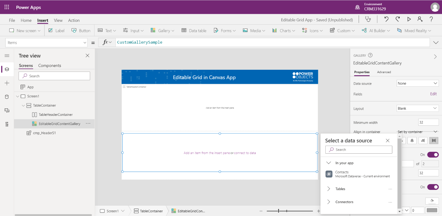
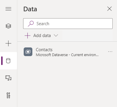
Step 5: Add Contacts Table to this App and bind it to Gallery’s Data source. We will show data from Contact.
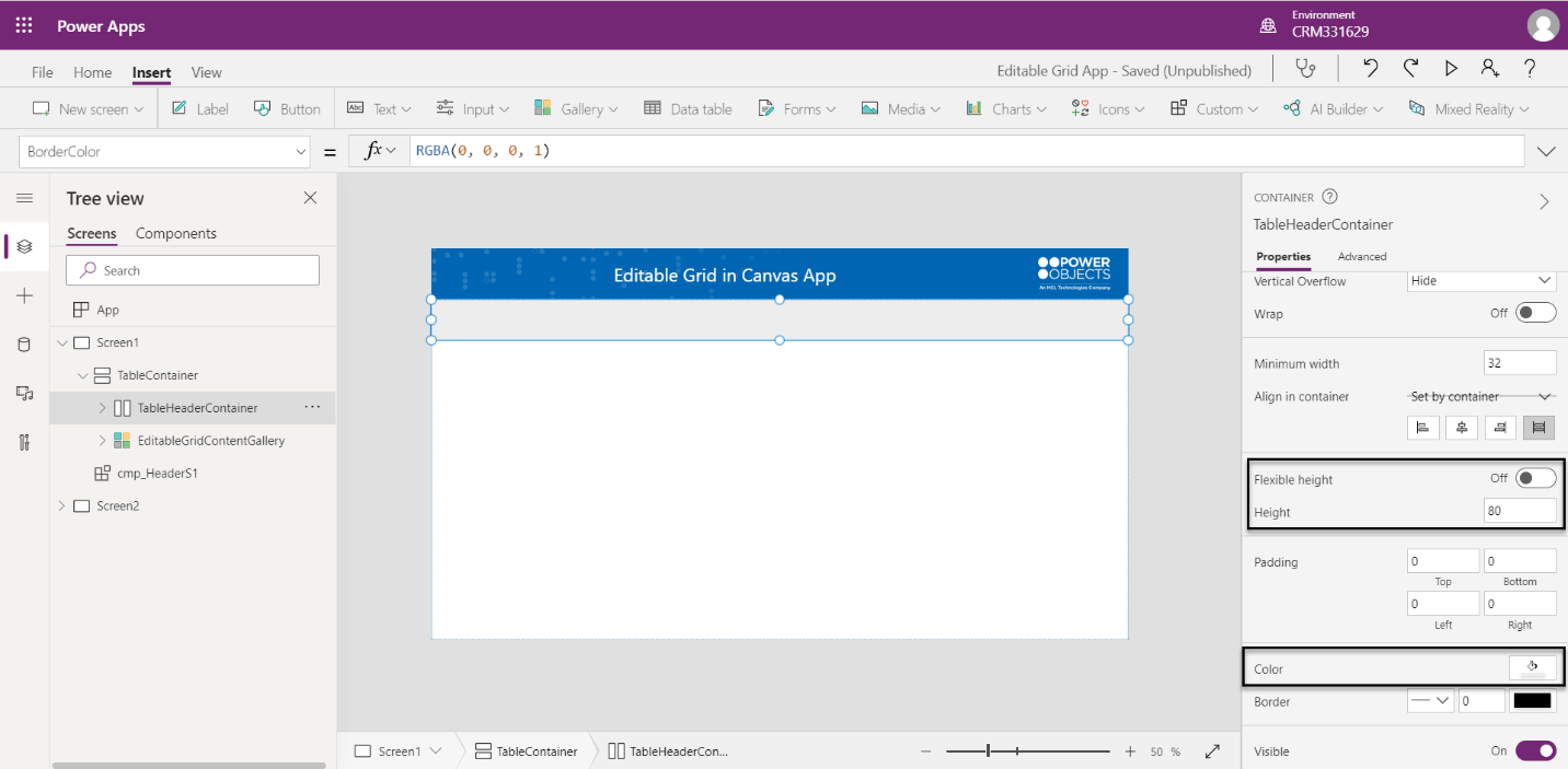
Step 6: Select TableHeaderContainer and turn off Flexible height. We can set a fixed height for this component. Example: we set height as 80. We also select fill color (Light Gray) for this Container.
Now we have a frame of Editable Grid, and we will continue to add details to this Grid.
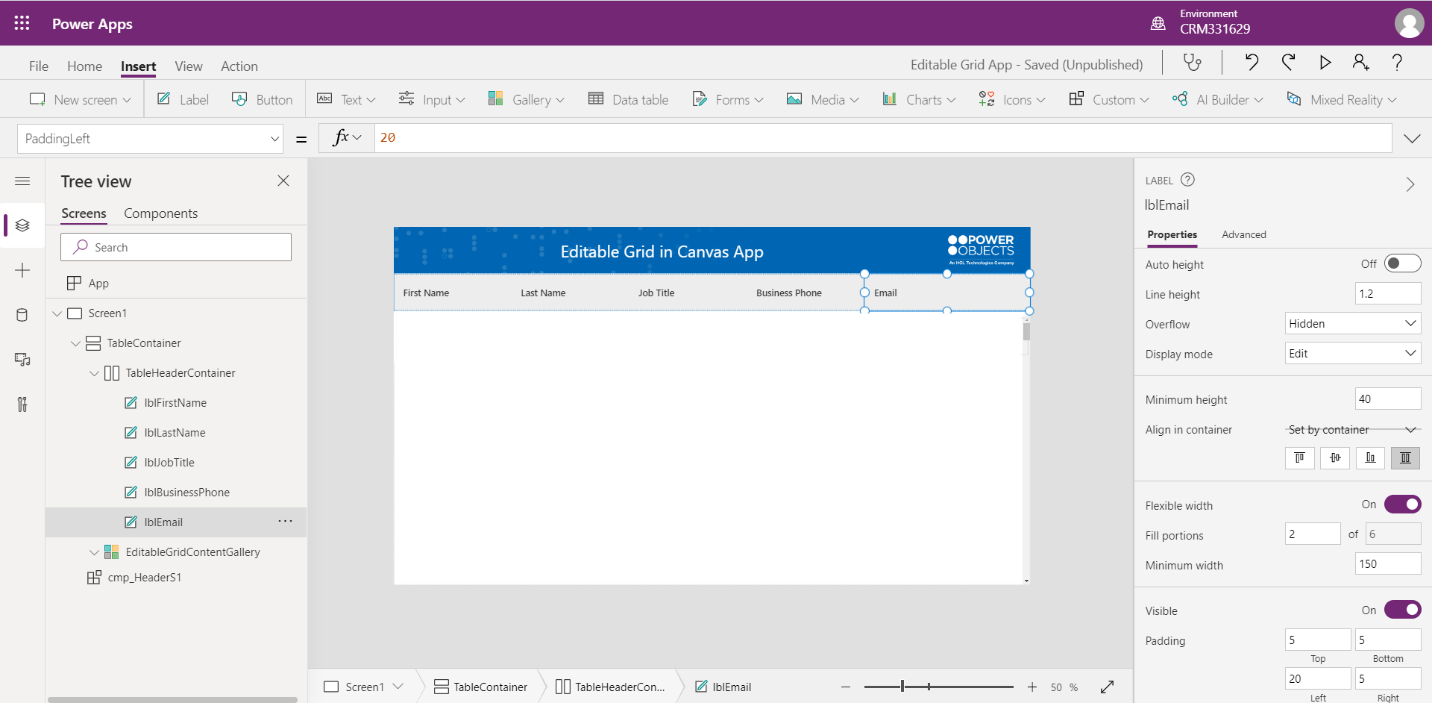
Step 7: Insert 5 labels inside the TableHeaderContainer.
Make sure the TableHeaderContainer Align (vertical) is Stretch.
Select all 5 labels and turn on Flexible width. You can decrease or increase Minimum width, so they automatically fit on the screen better.
Then rename all the labels so it is easier to read and enter column titles that we want to display from Contact Table. In our example, we choose to display “First Name,” “Last Name,” “Job Title,” “Business Phone” and “Email columns”.
As Email field needs more space, we adjust Fill Portions for lblEmail to 2 instead of 1, so it extends the width of Email field a little bit more.
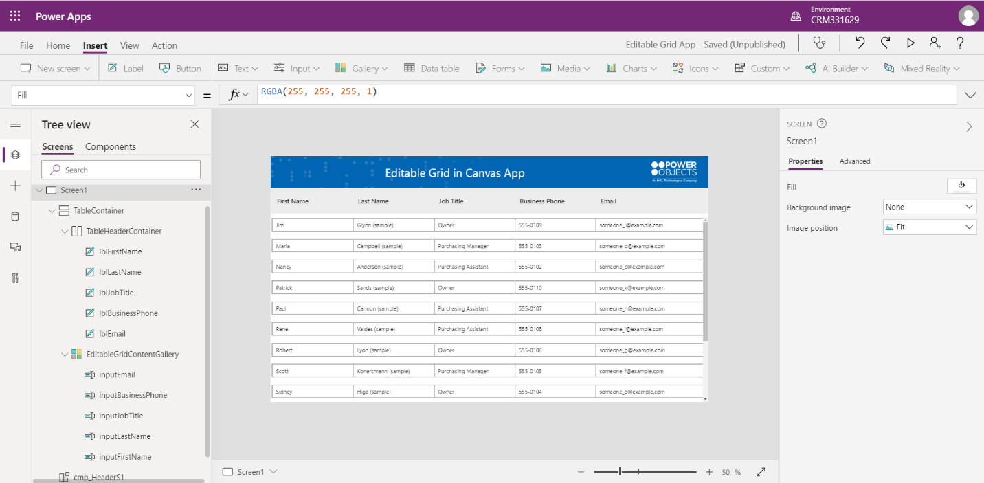
Step 8: Moving on to EditableGridContentGallery, insert 5 Text Inputs to the Container, rename all the Text Inputs accordingly and for each Text Input, we will map the X and Width property of each text input control to correspond with the Title labels in TableHeaderContainer
| Control | Property | Value |
| inputFirstName | X | lblFirstName.X |
| inputFirstName | Width | lblFirstName.Width |
| inputLastName | X | lblLastName.X |
| inputLastName | Width | lblLastName.Width |
| inputJobTitle | X | lblJobTitle.X |
| inputJobTitle | Width | lblJobTitle.Width |
| inputBusinessPhone | X | lblBusinessPhone.X |
| inputBusinessPhone | Width | lblBusinessPhone.Width |
| inputEmail | X | lblEmail.X |
| inputEmail | Width | lblEmail.Width |
Now we need to tie the Columns of Contact table to each Text Input field in EditableGridContentGallery
| Control | Property | Value |
| inputFirstName | Default | ThisItem.'First Name' |
| inputLastName | Default | ThisItem.'Last Name' |
| inputJobTitle | Default | ThisItem.'Job Title' |
| inputBusinessPhone | Default | ThisItem.'Business Phone' |
| inputEmail | Default | ThisItem.Email |
After binding data to the table, we will have something like this
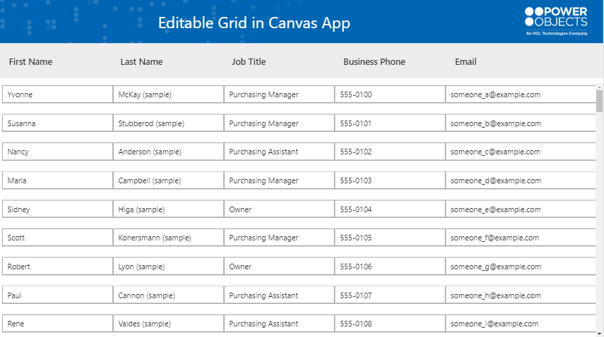
At this point, we have a responsive table in Canvas App. Next part includes steps to add Save, Create and Delete functions for this Table.
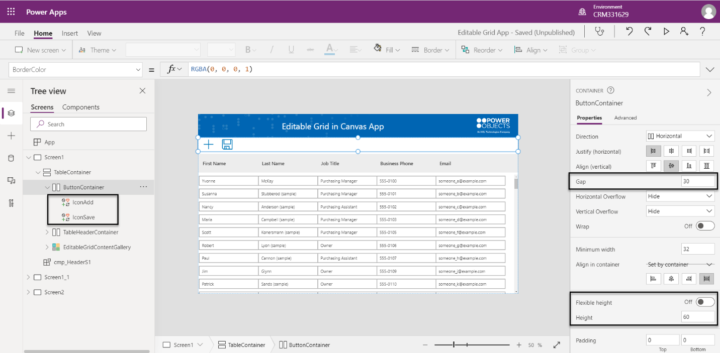
Step 1: Insert a Vertical Container inside TableContainer and name as “ButtonContainer”. This is the area we will add Buttons. Move this container to the top and Turn off Flexible Height. Adjust the size to fit on your screen. In our example, we put 60 for Height.
Insert Add Icon and Save Icon inside the container and rename them as “IconAdd” and “IconSave”.
Increase the Gap of “ButtonContainer” to 25 or 30 to give more space between Icons.
Implement Modify a Record function
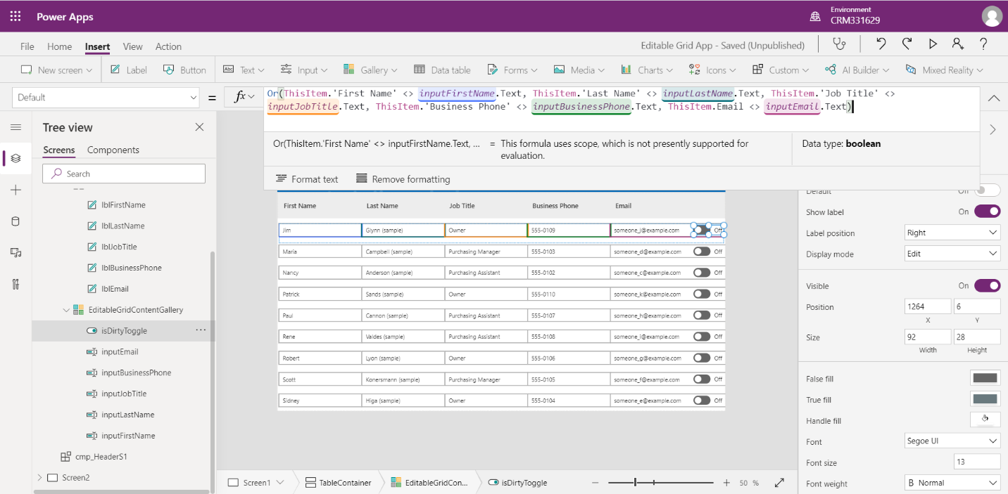
Step 2: Insert a Toggle inside the Gallery and name it as “isDirtyToggle”. We will use this Toggle as a flag to identify rows that are modified. In the Default property of this Toggle, we will check if values are modified inside those Text Input.
Example: Or(ThisItem.'First Name' <> inputFirstName.Text, ThisItem.'Last Name' <> inputLastName.Text, ThisItem.'Job Title' <> inputJobTitle.Text, ThisItem.'Business Phone' <> inputBusinessPhone.Text, ThisItem.Email <> inputEmail.Text)
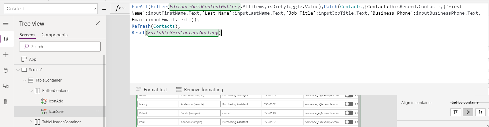
Step 3: Update code OnSelect of IconSave as below to patch modified data to “Dataverse”
ForAll(Filter(EditableGridContentGallery.AllItems,isDirtyToggle.Value),Patch(Contacts,{Contact:ThisRecord.Contact},{'First Name':inputFirstName.Text,'Last Name':inputLastName.Text,'Job Title':inputJobTitle.Text,'Business Phone':inputBusinessPhone.Text,Email:inputEmail.Text}));
Refresh(Contacts);
Reset(EditableGridContentGallery)
Implement Add a New Row function
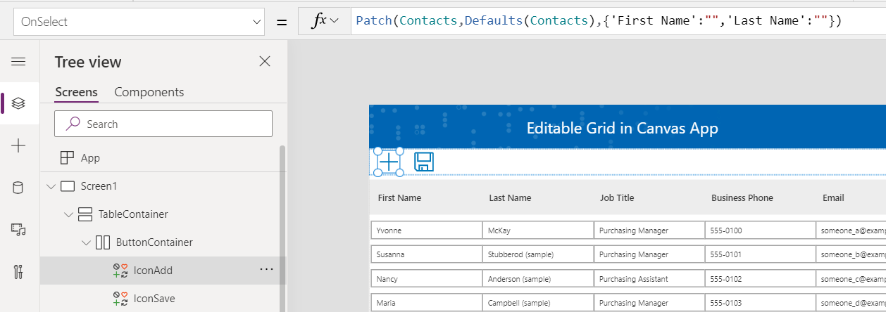
Step 4: Update the code OnSelect of IconAdd to add a new row in table. If we use Collection instead of binding data directly to the Gallery, we can create a new Row in collection first. For simplicity in this example, we will create a record directly in Dataverse, then user will enter detail below and save data to Dataverse table.
Patch(Contacts,Defaults(Contacts),{'First Name':"",'Last Name':""})
Step 5: At this point, we can hide the “isDirtyToggle” by changing Visibility = False
Implement Delete a Row function
Step 6: Add a Trash icon inside the Gallery, rename as “IconTrash” and adjust its position to fit with other Columns in a Row.
| Control | Property | Value |
| IconTrash | X | Parent.TemplateWidth - Self.Width-10 |
| IconTrash | Width, Height | 40 |
| inputEmail | Width | IconTrash.X - lblEmail.X |
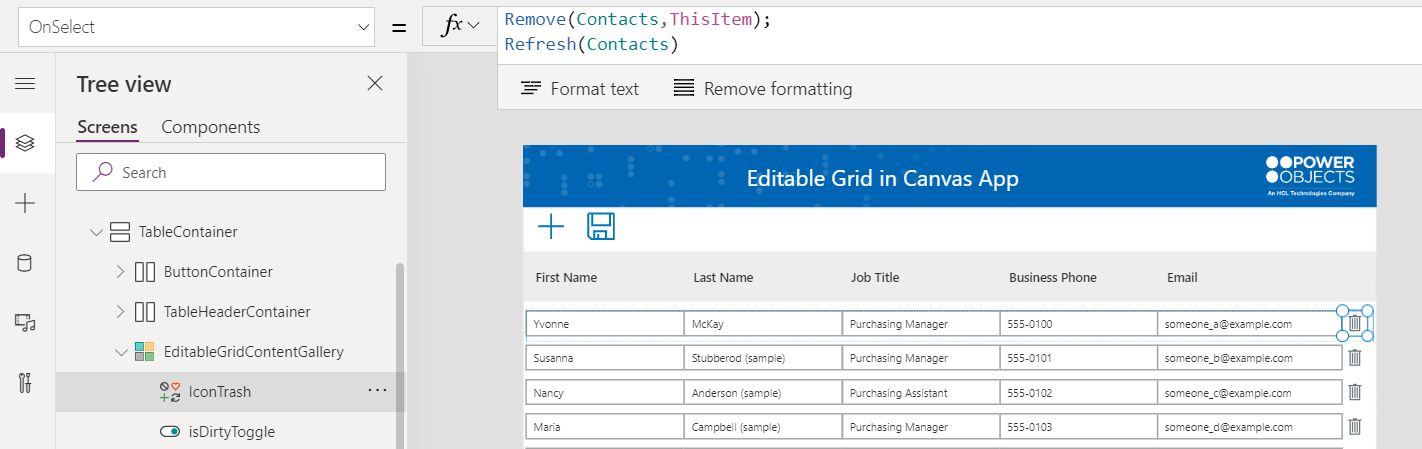
Step 7: OnSelect of IconTrash control, add below code:
Remove(Contacts,ThisItem);
Refresh(Contacts)
Implement View and Edit Mode
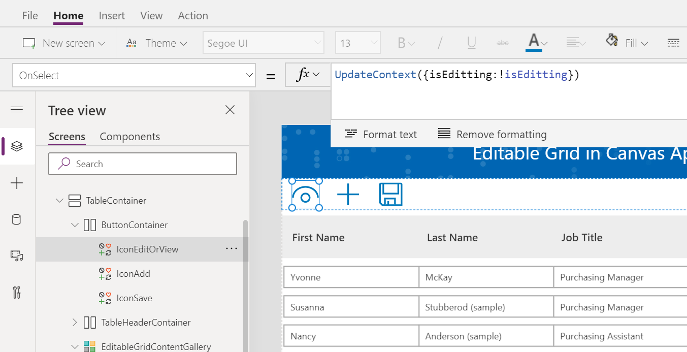
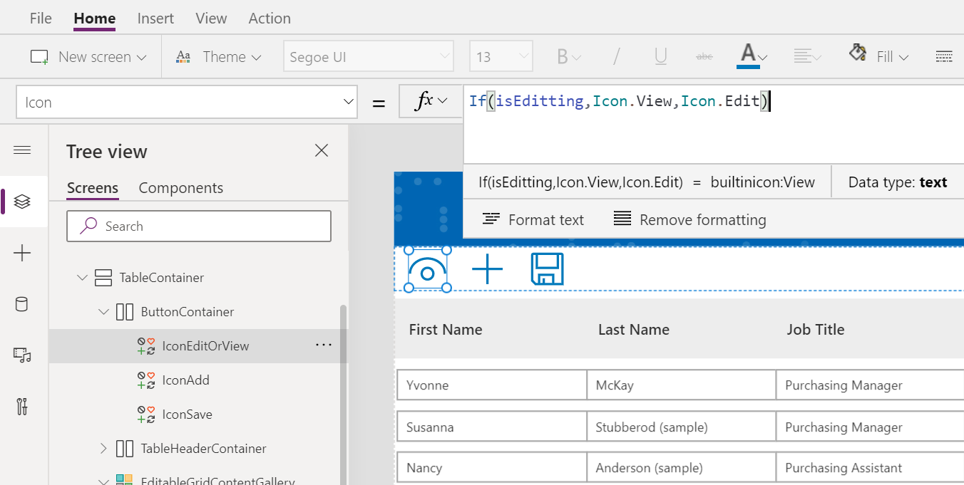
Step 8: Add an Icon Edit in the ButtonContainer, move Icon Edit to the Start of Container. Rename this icon as “IconEditOrView”. Set value for these controls’ properties as per below table.
| Control | Property | Value |
| IconEditOrView | OnSelect | UpdateContext({isEditting:!isEditting}) |
| IconEditOrView | Icon | If(isEditting,Icon.View,Icon.Edit) |
| Screen1 | OnVisible | UpdateContext({isEditting:false}) |
| inputFirstName | DisplayMode | If(isEditting,DisplayMode.Edit,DisplayMode.View) |
| inputLastName | DisplayMode | If(isEditting,DisplayMode.Edit,DisplayMode.View) |
| inputJobTitle | DisplayMode | If(isEditting,DisplayMode.Edit,DisplayMode.View) |
| inputBusinessPhone | DisplayMode | If(isEditting,DisplayMode.Edit,DisplayMode.View) |
| inputEmail | DisplayMode | If(isEditting,DisplayMode.Edit,DisplayMode.View) |
| IconAdd | DisplayMode | If(isEditting,DisplayMode.Edit,DisplayMode.Disabled) |
| IconSave | DisplayMode | If(isEditting,DisplayMode.Edit,DisplayMode.Disabled) |
| IconTrash | DisplayMode | If(isEditting,DisplayMode.Edit,DisplayMode.Disabled) |
Save and Publish. Now we have a Responsive Editable Grid in Canvas App!
Conclusion: The described method is a simple way to implement a Responsive Editable Grid from top to bottom. To improve performance, we can implement this with Read/Write/Delete in Collection instead of binding directly to Data Source. We will cover this in a future blogpost.
As always, happy Power Apps’ing!!!