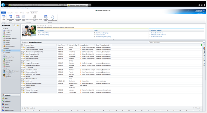
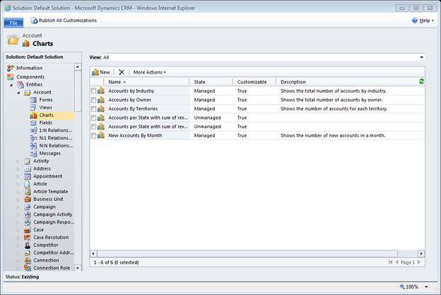
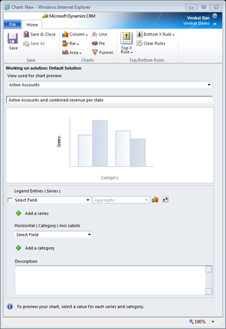
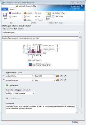
In this webinar, our experts showcase a variety of demo use cases of how different components of the...
Microsoft Business Applications Practice
- Products & Technology
- Industries
- Services
- Support
- Education
- Solutions
- Blog & Resources
Latest Blog Posts
PD9waHAgJGFyZ3MgPSBhcnJheSgKICAgICAgICAncG9zdF90eXBlJyA9PiAncG9zdCcsCiAgICAgICAgJ3Bvc3Rfc3RhdHVzJyA9PiAncHVibGlzaCcsCiAgICAgICAgJ3Bvc3RzX3Blcl9wYWdlJyA9PiAzLAogICAgICAgICdvcmRlcmJ5JyA9PiAnZGF0ZScsCiAgICAgICAgJ29yZGVyJyA9PiAnREVTQycsCiAgICApOwogICAgJHJlbGF0ZWRfaXRlbXMgPSBuZXcgV1BfUXVlcnkoICRhcmdzICk7CiAgICBpZiAoJHJlbGF0ZWRfaXRlbXMtPmhhdmVfcG9zdHMoKSkgOgogICAgd2hpbGUgKCAkcmVsYXRlZF9pdGVtcy0+aGF2ZV9wb3N0cygpICkgOiAkcmVsYXRlZF9pdGVtcy0+dGhlX3Bvc3QoKTsKICAgID8+CgkgIDxhIGhyZWY9Ijw/cGhwIHRoZV9wZXJtYWxpbmsoKTsgPz4iPgogICAgICAgIDxkaXYgY2xhc3M9Im5hdi1wb3N0LXdyYXAiPgogICAgICAgICAgPGRpdiBjbGFzcz0ibmF2LWZlYXQtaW1nIj4KICAgICAgICAgICAgIDw/cGhwIHRoZV9wb3N0X3RodW1ibmFpbCgpOz8+CiAgICAgICAgICA8L2Rpdj4KICAgICAgICAgIDxkaXYgY2xhc3M9Im5hdi1wb3N0LXRleHQiPgogICAgICAgICAgICA8ZGl2IGNsYXNzPSJwb3N0LXRpdGxlIj48P3BocCB0aGVfdGl0bGUoKTsgPz48L2Rpdj4KICAgICAgICAgICAgPGRpdiBjbGFzcz0icG9zdC1leGNlcnB0Ij48P3BocCB0aGVfZXhjZXJwdCgpOyA/PjwvZGl2PgogICAgICAgICAgPC9kaXY+CiAgICAgICAgPC9kaXY+CiAgICAgIDwvYT4KICAgIDw/cGhwCiAgICBlbmR3aGlsZTsKICAgIGVuZGlmOwogICAgd3BfcmVzZXRfcG9zdGRhdGEoKTsKPz4KPGRpdiBjbGFzcz0ibmF2LWJ0bi13cmFwIj4KICA8YSBocmVmPSIvYmxvZy8iIGNsYXNzPSJuYXYtcG9zdHMtYnRuIj5SZWFkIHRoZSBCbG9nPC9hPgo8L2Rpdj4=Latest Resources
 How Microsoft Power Platform is helping to modernize and enable...
 Deliver an Extraordinary Omnichannel Experience
Businesses that provide multiple touchpoints for customer service—powered by intelligent automation...
 Data Interoperability Key to Improving the Patient Experience
As the healthcare industry continues its shift to patient-centric care...
More...
PO TV
PO TV is your designation for Dynamics 365 video content.Events
PowerObjects offers a wide variety of Dynamics 365 events, trainings, and webinars.Careers
We're looking for bright, energetic and motivated people.News
PowerObjects' latest press releases and Microsoft Business Application news.Webinars on Demand
We record all of our webinars so they can be watched on demand at any time. - Contact


